
Before I start this blog post, let me say this: I’m not a doctor, not a scientist and not a public policy maker. I want to express my support to all of those impacted by COVID-19, and don’t want this blog post to sound soulless. I’m a tech enthusiast, who likes numbers, which is why I’m doing this analysis of the COVID-19 data that interests me.
The coronavirus and COVID-19 has changed a lot in life. I haven’t been on a plane since the end of February and I haven’t been in an office since May (I dropped in one day to get a new laptop). I have been working from home, and not going out much except to the supermarket and to go running. All in all, both my wife and I are incredibly lucky with our situation. We are both still healthy, my wife gets tested every other week at work and we both still have our jobs.
To make sense of everything that is going on, I have been doing some of my own analysis on the COVID-19 numbers that are available. This is mainly to satisfy my own curiosity about what’s happening in the counties around me compared to the rest of the state of California.
For this analysis, I’m using a Jupyter notebook, and I some Python using primarily the Pandas package to manipulate the data and matplotlib to plot the data. I’m currently running my notebook on Azure notebooks, which is a free environment to run Jupyter notebooks. Sadly, the service will be discontinued, so in the future I’ll have to look to a new place to run my Jupyter notebooks easily.
I made the notebook itself available on Github.
The process of analyzing data
When analyzing data in Python, you’ll typically go through 3 steps:
- Getting the data. You’ll need to find a reliable source to get up to date data from.
- Data cleanup and transformation. Once you have the data, you’ll have to massage the data a little. This mean cleaning up the data, extracting the data that is relevant for you, and making sure it’s in a format that you can use in the next step.
- Presentation and visualization. This last step means showing the data in a good format. Typically you iterate a bit between steps 2 and 3, since as you’re looking at data, you’ll find out new data points you’ll want to extract from it.
Let’s have a look at how I’m doing this with the COVID-19 data.
Step 1: Getting the data
There’s a number of places to get data about COVID-19. I personally like the COVID-19 Data Repository by the Center for Systems Science and Engineering (CSSE) at Johns Hopkins University hosted on Github. I realize that’s a mouthful in terms of title. This GitHub repo contains frequently updated data about COVID-19 related infections and deaths worldwide, with special datasets for the US.
In my case, I’m using the following two datasets:
To import the datasets into the Jupyter notebook, you can use to following Python code:
%matplotlib inline
import matplotlib
import numpy as np
import matplotlib.pyplot as plt
import pandas as pd
cases = pd.read_csv('https://raw.githubusercontent.com/CSSEGISandData/COVID-19/master/csse_covid_19_data/csse_covid_19_time_series/time_series_covid19_confirmed_US.csv')
deaths = pd.read_csv('https://raw.githubusercontent.com/CSSEGISandData/COVID-19/master/csse_covid_19_data/csse_covid_19_time_series/time_series_covid19_deaths_US.csv')
The first couple of lines are import statements to import the necessary libraries in Python. Afterwards, we’re creating two objects, cases and deaths that represent the raw datasets, loaded into a Pandas Dataframe.
A DataFrame in Pandas is a very useful object to work with tabular data. I’ve learnt how to work with those objects in the following course on Coursera, that I highly recommend.
With the data imported, you can have a look at the data using the following commands:
print(cases.head())
print(deaths.head())
This will show the first 5 rows of the data, which is useful to get a high-level understanding of the data.
Now that have the data loaded, we can move on to the next step, Data cleanup and transformation.
Step 2: Data cleanup and transformation
Next, we’ll do cleanup of the data. I’ll walk you through the invidual steps and what they mean first for the cases object, and then show you how you can do all of this in a single command for the deaths object.
First up: I’m only interested in data from California. The reason I’m filtering out California early on in the process is to make the data transformation work lower intensity on the compute and also because the US has duplicate county names. By filtering by California early, I avoid this issue. To filter to only data in California, you can use this code:
cases_CA = cases[cases["Province_State"] == "California"]If you look at the data, you’ll notice that the dates are actually columns in this dataset. It would be easier to work with the data if the dates were rows, which we can do by transposing the data. Transposing means turning rows into columns and columns into rows.
Before transposing, I’m going to introduce one additional step: I’m going to set the index of the current dataframe to the county name. This will in turn have the effect of turning the county name into the column header in the transposed dataset. This is how you would do both steps in Python:
cases_CA_indexed = cases_CA.set_index("Admin2")
cases_CA_T = cases_CA_indexed.T
If you were to have a look at the data now, you’ll notice that there’s a number of rows now before we get actual case data. To see this happen, you can use the following command in a cell in your notebook:
cases_CA_TWhich whill show you:
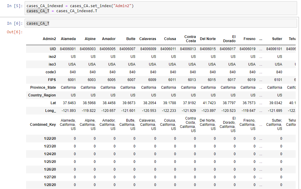
To drop these rows, you can use the following command:
cases_clean = cases_CA_T.drop(['UID','iso2','iso3','code3','FIPS','Province_State','Country_Region','Lat','Long_','Combined_Key'])And this gives us a clean dataframe to work with for visualization.
All of these steps can be executed as a single command in Python. An example on how this can be done with the deaths object is shown here:
deaths_clean = deaths[deaths["Province_State"] == "California"].set_index("Admin2").T.drop(['UID','iso2','iso3','code3','FIPS','Province_State','Country_Region','Lat','Long_','Combined_Key']).drop("Population",axis=0)This is a pretty long statement, but it optimizes a bit of memory usage since you don’t store all the intermediate objects.
Now that we have the raw data, we can start making plots with it! (btw. as I mentioned in the intro, this is an iterative process, we’ll come back to data cleaning and transformation after the first graphs.)
Step 3: Presentation and visualization
In this step, we’ll create a first couple of graphs. In my case, I want to visualize the data for the 4 counties nearest to me. To do this, I’ll use the following object to refer to the counties I want to visualize:
counties = ['Alameda',
             'San Francisco',
             'San Mateo',
             'Santa Clara']
To show the cases in these 4 counties in a graph, we can use the following code:
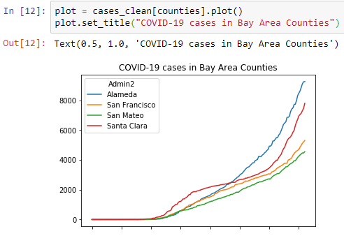
plot = cases_clean[counties].plot()
plot.set_title("COVID-19 cases in Bay Area Counties")
This generates a nice first graph:
Let’s create a similar graph for the deaths, but make this graph a little bigger.
plot = deaths_clean[counties].plot(figsize=(20,10))
plot.set_title("COVID-19 deaths in Bay Area Counties")
Which will create this graph that is a little bigger:
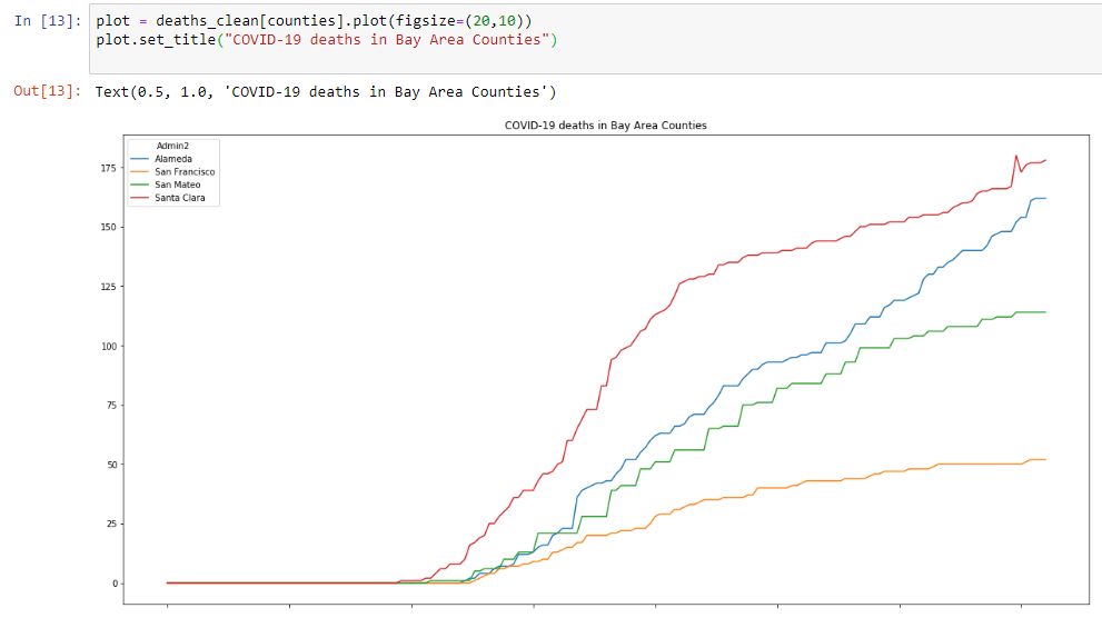
Both graphs show a troubling sign. Cases and deaths are going up. However, it’s hard to see how much this is increasing. Also, it’s hard to compare counties, since these numbers are absolute numbers and not expressed in cases per million inhabitants. Let’s start another step 2, and do some more data prep, now to include rolling averages of new cases and generate data per million inhabitants.
Revisit step 2: including rolling averages of new cases/deaths and data per million inhabitants
In order to generate rolling averages of new cases/deaths, we’ll have to do two things:
- Subtract each row by the previous one (to get the increase). We can use the
diff()function on the dataframe for this. - Create a rolling average over the new dataset. We can use the
rolling()function to create a rolling windows and then use themean()function to create the average.
This can be done with the following code:
cases_diff = cases_clean.diff().rolling(window=7).mean()
deaths_diff = deaths_clean.diff().rolling(window=7).mean()
In order to generate the data per million inhabitants, we’ll first need to know the amount of inhabitants per county. I created a quick gist on GitHub that contains inhabitants per county for California. I believe I took this data from Wikipedia when I started doing this analysis. We can load this using the following code:
pop = pd.read_csv('https://gist.githubusercontent.com/NillsF/7923a8c7f27ca98ec75b7e1529f259bb/raw/3bedefbe2e242addba3fb47cbcd239fbed16cd54/california.csv')There’s one issue however with these county names. They contain the word “county”, whereas the dataset from CCSE does not have the word “county”. Let’s remove the word county from the pop dataframe:
pop["CTYNAME"] = pop["CTYNAME"].str.replace(" County", "")We’ll also drop the GrowthRate out of the dataframe, and set the index to the county name:
pop2 = pop.drop('GrowthRate',axis=1).set_index('CTYNAME')And now, we can adjust the numbers in the cases and death dataframes.
cases_pm = cases_clean.copy()
for c in pop2.index.tolist():
    cases_pm[c] = cases_pm[c]/pop2.loc[c , : ]['Pop']
cases_pm = cases_pm*1000000

deaths_pm = deaths_clean.copy()
for c in pop2.index.tolist():
    deaths_pm[c] = deaths_pm[c]/pop2.loc[c , : ]['Pop']
deaths_pm = deaths_pm*1000000
Then finally, let’s create two final objects, that will show the cases and deaths per million increase.
cases_pm_diff = cases_pm.diff().rolling(window=7).mean()
deaths_pm_diff = deaths_pm.diff().rolling(window=7).mean()
Quick summary of this section:
- We created objects to represent case and death increases with a 7 day rolling average.
- We created objects to represent cases and death per million.
- We created objects to represent case and death per million increases with a 7 day rolling average.
Now that we have these objects, let’s do some more plotting:
Step 3 revisited: more plots
Let’s start by plotting the case increases and the case increases per million for the Bay Area:
plot = cases_diff[counties].plot(figsize=(20,10))
plot.set_title("7 day moving avg of new COVID-19 cases ")
plot = cases_pm_diff[counties].plot(figsize=(20,10))
plot.set_title("7 day moving avg of new COVID-19 cases ")This will show us the following 2 graphs:
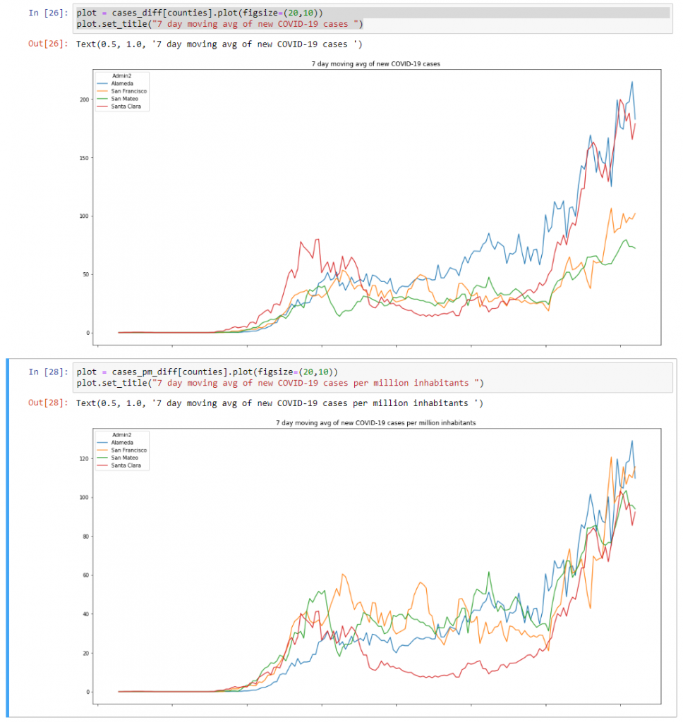
What the difference between these two graphs show is that the trend for new cases – expressed per million inhabitants – in the Bay Area is pretty similar right now. This same trend isn’t shown in the data expressed without filtering per million.
Let’s also have a look at the amount of daily deaths per million for the Bay Area:
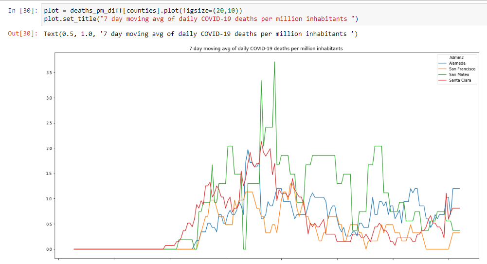
This graph is a little more motivating. Although case counts are rising, deaths are relatively flat. This still isn’t good news, because every COVID-19 related death is one too many.
Now that we have this data, let’s have a look the top 10 counties in CA based on total cases and deaths per million inhabitants. To do this, we can use the following code:
plot = cases_pm.sort_values(axis=1,by='7/20/20',ascending=False).iloc[:, : 10].plot(figsize=(20,10))
plot.set_title("Top 10 counties by COVID-19 cases per million inhabitants")
plot = deaths_pm.sort_values(axis=1,by='7/20/20',ascending=False).iloc[:, : 10].plot(figsize=(20,10))
plot.set_title("Top 10 counties by COVID-19 deaths per million inhabitants")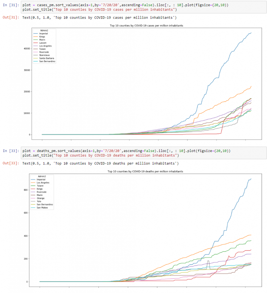
And then one final graph I wanted to look at was the top 10 counties by case increases and daily deaths per million:
plot = cases_pm_diff.sort_values(axis=1,by='7/20/20',ascending=False).iloc[:, : 10].plot(figsize=(20,10))
plot.set_title("Top 10 counties by 7 day rolling avg COVID-19 case increases per million inhabitants")
plot = deaths_pm_diff.sort_values(axis=1,by='7/20/20',ascending=False).iloc[:, : 10].plot(figsize=(20,10))
plot.set_title("Top 10 counties by 7 day rolling avg COVID-19 daily deaths per million inhabitants")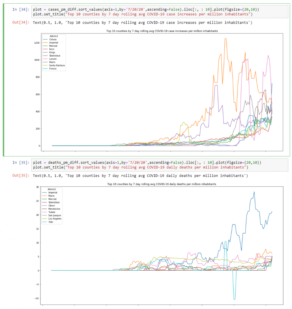
Summary
And this is how I do some of my own analysis of the available COVID-19 data. I initially started doing this to use some of the skills I learnt in the Coursera course I mentioned, but now I run this notebook regularly, just to get a focused look on the data for California, and more specifically the Bay Area.
Feel free to use this notebook and adapt it to the data you’re interested in.